
 Yahoo Autos
Study: The typeface in your car could be dangerous
When you're in your car, you're supposed to be driving, not reading. But dangerous distractions lurk right on the dashboard, starting with the typeface of onboard navigations systems, and that typeface may be dangerous.
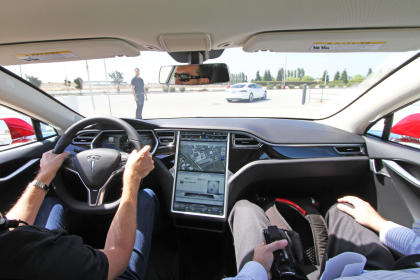
That's what a new study from MIT AgeLab and Monotype is suggesting. As surfaced by Gizmodo, researchers tested two different typefaces on dashboard navigation systems (which require drivers to read visual menus, touch the screen with their selections, read maps, and so on) and found that a font that is harder to read can cause higher driver distraction, which could lead to accidents.
In the study, one commonly used typeface in cars -- what the researchers called "square grotesque" -- faced off against the "humanist" font. The white paper notes that, for male drivers aged 36-75, "a 'humanist' typeface resulted in a 10.6% lower visual demand as measured by total glance time as compared to the 'square grotesque' typeface. Total response time and number of glances required to complete a response showed similar patterns."
As a researcher points out, the "difference in glance time represents approximately 50 feet in distance when traveling at U.S. highway speed."
