
 Yahoo Autos
 Spot The Difference: Porsche's New Logo Edition
New logos are all the rage these days, with Skoda opting to replace its insignia with flat text, Aston Martin unveiling a simplified wings design, and even little old Jalopnik giving its header a refresh. Not wanting to miss out on all the new logo hype, Porsche has also rolled out a new badge, but we’ll forgive you if you haven’t noticed a difference.
Those fun-loving Germans have apparently spent three years refining the iconic Porsche emblem to come up with a new badge that will begin rolling out on cars later this year. The launch of the updated logo was timed to coincide with the brand’s 75th anniversary, which also takes place this year.
Read more
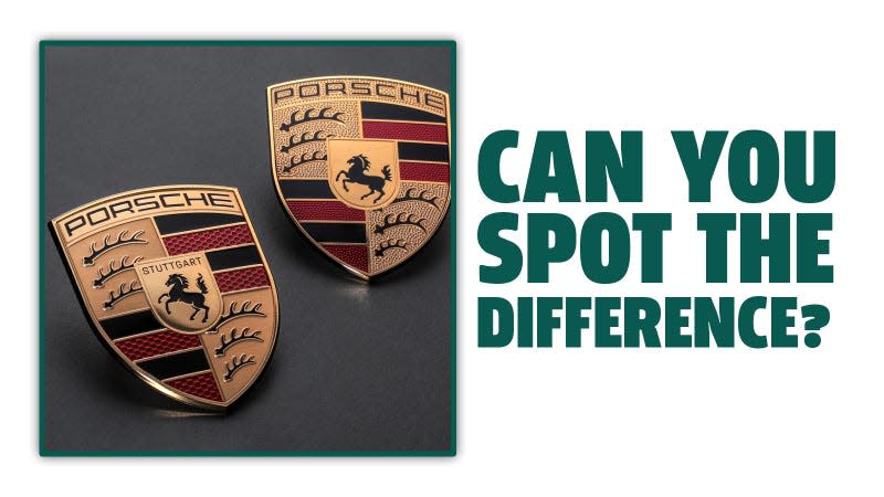
According to Porsche, there has been “a number of revisions” made to the Porsche logo, so how many of them can you spot? By our count, there are six easily identifiable differences between the two logos you see above. Got them all? Now, scroll down for the answers.
The first three to spot are the different textures on the logo. Instead of a rough, dotty texture around the antlers and the Porsche lettering, the new logo is smooth. There are more textural changes in the red stripes, as these now incorporate a honeycomb pattern.
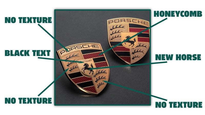
The next big change comes when you look at the logo’s center. Now, the Stuttgart text is printed in black, rather than simply being embossed, to make it better stand out. The final change has been made to the horse emblem, which has been updated with a new tail and more detail around its legs.
So that’s three texture changes, a honeycomb pattern, a new Stuttgart print, and a shiny new horse. Do you spot any other differences?
