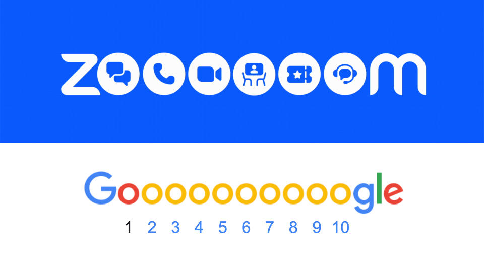
The new Zoom logo is giving me major Google vibes

If anyone had a "good" lockdown, it was Zoom. The video conferencing software became an indispensable tool during the pandemic, connecting friends, relatives and colleagues alike. But it seems the brand doesn't want to be known solely for video calls.
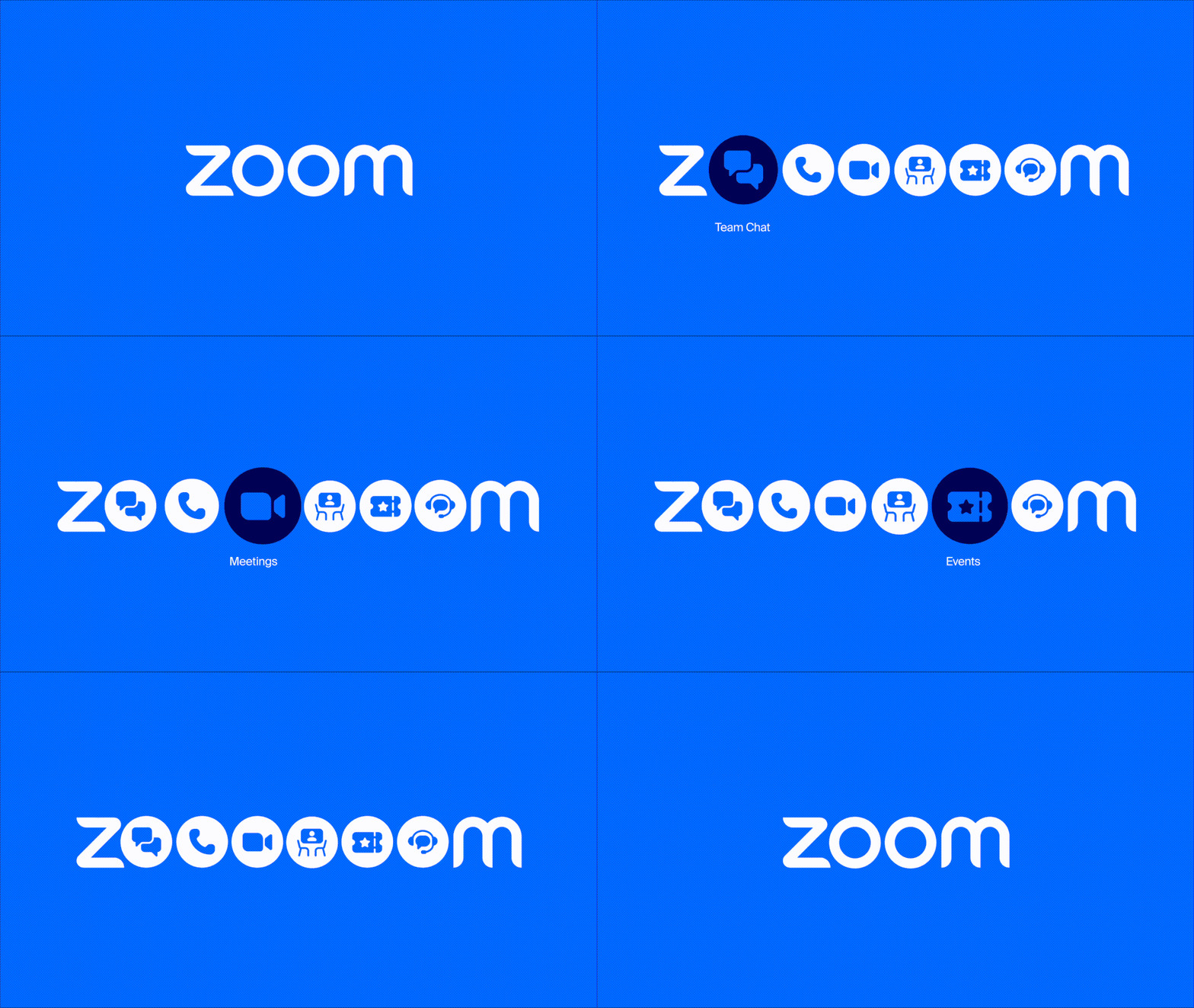
Designed to emphasise its entire suite of features (it has a suite of features?!), Zoom has launched a quirkily animated new version of its logo. The design features multiple 'O's, each featuring one of the communication platform's apps. But it feels a little familiar. (Looking for logo inspiration? Check out the best logos of all time.)

In the new graphic, each additional 'O' contains the icon for one of Zoom's many services, including Rooms, Events and Team Chat. The latter is a rebranded version of Zoom Chat, which Zoom says will "usher in the future of persistent messaging and further enhance teamwork and collaboration."

As well as the 'expanded' logo, Zoom revealed a slightly tweaked version of its wordmark. While the company intends to "lean on the main visual" of the aforementioned 'Zoooooom' design, it's also introduced a new colour palette, with the traditional logo re-rendered in a slightly bolder, bluer design (above).
But while the new expanding visual is a fun way of highlighting the company's many services, I can't look it it without thinking of Google. Of course, the big 'G' presents its search results pages as a series of 'O's in much the same way, letting users select a page by clicking one of 10.

While Zoom might have taken inspiration from Google's search results menu, it might do well not to do the same when it comes to the company's new suite of Workspace icons, which have been slated for their confusing similarity. If you're inspired to embark on a logo project of your own, take a look at our guide on how to design a logo.
Read more:

 Yahoo Autos