
 Yahoo Autos
 These Are the Ugliest Race Cars of All Time, According to You
U.G.L.Y. You ain’t got no alibi you ugly.
Designing a race car is no easy feat, especially when you have to consider all the logistics and people who are required to have their hands on it. First, designers must consider the series’ sanctioning rules, which dictate the majority of a racer’s design. Then, there are the aerodynamic quips designers can play to eke out an ounce or more performance. Finally, there’s the livery showcasing all those lovely sponsors that pay teams money to make this all possible. Sometimes everything comes together in a beautiful eye-catching package. Sometimes, it’s an awful sight.
To find examples where it all went wrong for designers, we turned to you and asked what you think are the ugliest race cars of all time. From rogue Formula 1 regulations to early attempts at aerodynamics, you turned up some real stinkers.
Read more
So, sit back, relax and click through some of the ugliest racing cars to have ever graced a track. If you dare.
Ligier JS5
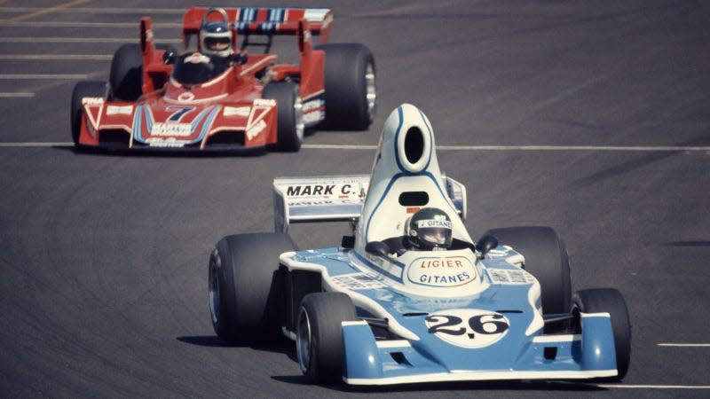
“I can’t say I’m a huge fan of the short-lived, large air scoop fad of 1970's Formula 1. The Ligier is among the worst offenders, but even the smaller ones look goofy to me.”
Starting things strong with a bulbous F1 car from 1976. This gaping airbox on the back of the Ligier was nicknamed the teapot and was only used in the early stages of the season, before regulations came in to shrink it down.
Suggested by: forkish
March 711
“Not sure what Robin Herd and Geoff Ferris were smoking when they concocted the 71/72 March 711. It did get one fastest lap, but no wins in 22 GPs.”
There are few who would argue that this front end doesn’t look dumb. It looks like a space for the March engineers to set up a picnic mid pitstop. Ridiculous.
Suggested by: gto62
Caterham CT05

“Caterham CT05 in a landslide.
“Really, the stepped-nose era of F1 cars from the mid 2010s were all hideous, horrible point in time for regulations when it came to aesthetics.”
It’s just so unbelievably hideous, I could probably have just filled this slideshow with various awful angles of Caterham’s 2014 car. Still, at least the team had some lovely merch.
Suggested by: @MichaelEverson1 (Twitter)
Fair Point

“The entirety of the 2014 F1 grid.”
This was a pretty dark period for Formula 1 when it comes to the looks department. The only car that really pulled it off was the Red Bull, and it’s still a bit on the weird side.
Suggested by: @Sub_Zer090 (Twitter)
Another Bad Year for F1

“Every car made to the 2012 F1 regulations. Clearly no one at the FIA thought through what would happen when they made these regs. Embarrassing.”
Respectfully, you’re wrong. The 2012 Formula 1 cars look good, actually. They’re like big angry sharks swimming round with their mouths open, a vibe I am here for.
Suggested by: mythrenegade
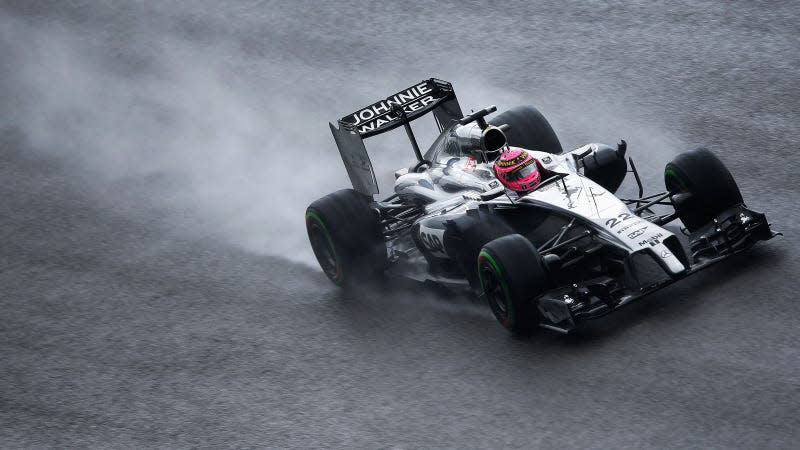
Next-Generation NASCAR

“I’ll take heat for this. Any modern era NASCAR. It’s just so..... Bleh.”
If there’s one thing you don’t want your racing car to be, it’s “bleh.” It’d be better to have a hideous car that sparks conversation than one that’s just a bit bland. Do better NASCAR.
Suggested by: matchew4u
