Yahoo Autos
 All 50 U.S. license plates ranked, from best to California
American license plates are pretty darn interesting when you consider the drab white and yellow rectangles found in Europe. For something that's on a car for a purely practical purpose, they're surprisingly artistic. Well, some of them at least. You can thank Idaho for this North American quirk (Canada and Mexico have a similar concept), when in 1928 the state issued a green license plate with letters stamped into a brown potato and the words IDAHO POTATOES on the bottom. It was basically forcing its citizens to advertise Idaho's cash crop when traveling outside the state. People hated it and it went away after a year (although "Famous Potatoes" saying would appear in the 1950s and never go away), but it established the tradition of states first putting slogans and nicknames and the bottom of their plates, followed eventually by unique emblems and designs.
So here is a definitive ranking of all 50 United States license plates. At least for now, this is now the fourth version of this list after new plates were introduced and I quite frankly changed my mind about various entries. Now, for the record, the Northwest Territories have unquestionably the best license plate in North America, but 50 is already way too many things to create a list about, and I had to draw the line somewhere. So no D.C. or territories, either.
And some housekeeping. These rankings were chosen by a blue-ribbon commission consisting of myself. The criteria I considered included whether it enhances or worsens a car's aesthetics; is it symbolic of the state; is it distinctive enough to ID without reading the state name; is it stamped or printed/flat; and does it have a slogan, nickname or website (the latter is a bad thing and stupid — am I supposed to call it up while driving???).
I also only considered "standard" plates, or those that the DMV will give you by default. So no no-cost-option plates. In instances where there are multiple standard plates, I just picked the one I liked best. So on we go. And yes, I'm totally biased against the state you live in.
Tier 1: The colorful classics
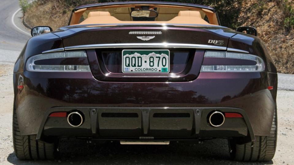
1. Colorado
Every other state in the country wishes it could've come up with a unique, colorful and iconic license plate design 60 years ago and pretty much just moved on with their lives thereafter. Oh sure, the mountains have oscillated between white and green, the shade of green has been tweaked, and the mountains were given some detailing, but this is pretty much the same plate as always. There's only one state this could possibly be from, due to its familiarity/longevity, distinctive color scheme and that everyone knows Colorado is filled with mountains. I also like that there are only six digits separated with a little dot (yay symmetry!) and that the numbers are stamped ... for now. Colorado is switching to printing, which is bad, so depending on how that ends up looking, we could have a new No. 1 someday.

2. New Mexico
Hmm, you don't like teal? Sorry, I love it, but more important, "turquoise" is truly indicative of New Mexico. The overpasses in Albuquerque are this color, for Pete's sake. The design itself, which actually got better when adapted from its original centennial design, is clean and classic, yet also distinctive. You have the state nickname of "Land of Enchantment" in a neatly sized and placed font that doesn't conflict with the equally classy "New Mexico USA" below. The state's "Zia" symbol, which has been on its plates for almost ever, makes its boldest statement yet. The use of yellow is also an obvious nod to the other official color of New Mexico, which has been on its license plates since the early 1960s. And still is, actually. The DMV lists both the teal plate and the yellow plate as "standard" plates (as opposed to no-cost options or pay-for options as other states have). I chose the better of the two here, but even the yellow one would've been up here near the top.
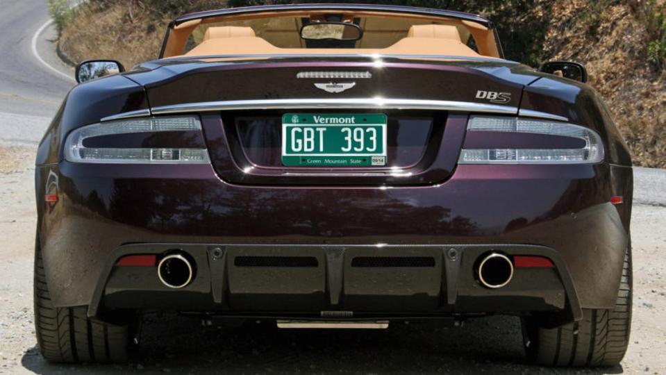
3. Vermont
OK, so this is pretty much the same color as Colorado's, but I don't exactly see that as a bad thing considering the color is great and that it doesn't appear in any other standard license plate. Besides the color, Vermont has the weird rectangle around the stamped registry numbers, clean and appropriate fonts for "Vermont" and "Green Mountain State," and a little tree in the upper right hand corner because it's Vermont. There are only three things that say "Vermont" more to me than this license plate: Bernie, Ben and Jerry.
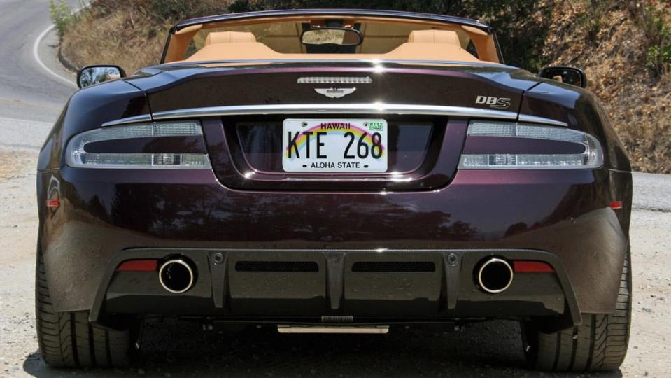
4. Hawaii
True, you're not going to see this one very often here on the mainland, so the thing has an inherent mystique. Still, even if you'd never seen one of these before, you'd instantly know that it's from Hawaii. What other state would put a rainbow on its license plate ... and do so for 30 years? And despite having, well, a rainbow of colors on it, the plate still manages to be clean and legible. Sure, it may not complement every car color as well as some of the other designs below, but dude, it's the Hawaiian license. It's cool.

5. Delaware
This plate is like an NBA team in the 1990s that didn't change its color scheme and make its logo a cartoon. Sure, they looked old-fashioned back then, but now that fashion has come back to classic, they're quite happy they stayed the course. So be the Delaware license plate. Sadly, it's flat printed and looks a bit cheap, but it's also been that way for decades. Consistency! The classy dark blue color framed in gold with matching writing is timeless enough to make up for it.
Tier 2: Symbolic, distinctive and tidy
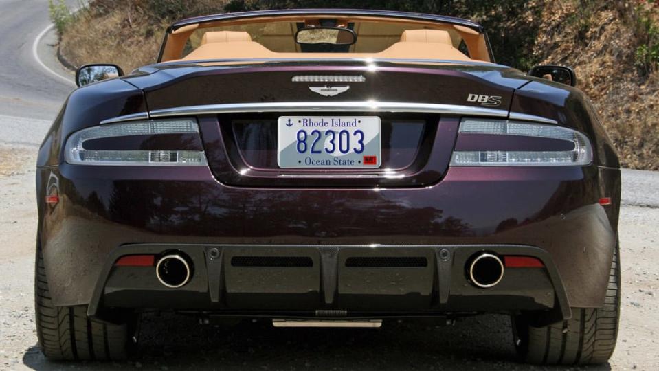
6. Rhode Island
Like Hawaii, this plate is a distinctive classic that relies upon a unique background design rather than a bold color. Rhode Island is the Ocean State, therefore it has a big wave. And an anchor. You also gotta love that so few people live in Rhode Island, they don't even have to worry about stuffing six digits onto the thing, let alone seven. Indeed, you can have only one digit … and people pay big money for them.

7. New York
This is New York's recently-released plate and it's just terrific. Somehow, they managed to visually represent this diverse state from Niagara Falls and the forested mountains of Upstate New York to the skyline of Manhattan and the coast of Long Island. There's also a Statue of Liberty, long a N.Y. plate staple, plus a map of the state, the state's name, the bold slogan of EXCELSIOR and seven digits. This should be a busy mess, yet it's clean, classy and would look great on basically any car. The old plate looked like it should be exclusive to cabs or government agencies. This one is an Aaron Judge 470-foot blast. It's even stamped rather than printed. Never change it.

8. Nevada
This is a rare modern plate that manages to be colorful without being busy, cartoonish or clashy with the car. As baseball teams of the 1970s and '80s will attest, this shade of powder blue pairs well with most colors. It's looked great on every car I've seen wearing it. The design works, too. There are multi-color mountains, but they're artistically rendered with a geometric pattern instead of a literal depiction. The state map is also used as a registry divider (six digits!) and the state name appropriately features a cowboy-ish font. I honestly don't know how true the slogan of "Home Means Nevada" rings to those who live there, but it's a creative change of pace from the long-used "The Silver State."
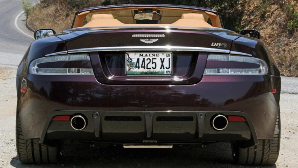
9. Maine
Maine could have this as its standard plate. We would laugh and I'd then direct it way down this list to the "Toon Town" tier. Instead, it has this classy design. Dubbed "The Chickadee Plate," it's been around since the turn of the century with its bird (I assume a chickadee) on a coniferous branch that distinctively offsets the registry. How indicative is a chickadee to Maine? I have no idea, but I'm not from there. The silly lobster is for outsiders like me, this is for Mainers. Maineists? I really should learn more about Maine. Anyway, the plate has an atypical shade of green for the pine needles and diffused forest scape, the black trim and letters really pop, and "Vacationland" is just the right shade and size.
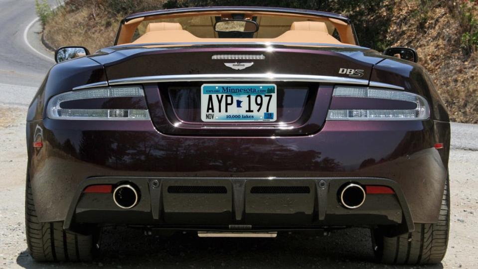
10. Minnesota
This is another great piece of design that goes back decades. With its unique shade of blue, centered state map, "10,000 Lakes" slogan and lake imagery above, "Minnesota" doesn't even need to be written on the thing to indicate where that car is from. Which is why it's a shame that the state cluttered it up, first with "Explore" in the upper left and then with the first appearance on this list of an infernal website. That the plate integrates the ".com" after "Minnesota" at least rescues the plate a bit, but the fact remains that it busies an original great design.
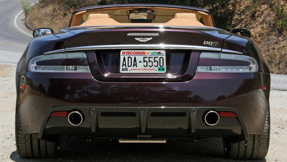
11. Wisconsin
This plate is pretty dated due to its italicized fonts that have been out of fashion for 20 years (and yeah, I'm grading on fonts here. Rest assured, it'll get worse than this). There's also a lot of colors going on that can make it look a bit cheap. Still, this is unmistakably Wisconsin … it's looked like this since 1986, and there's nothing else like it (especially the combination of flush-left state name and the consistent visual interpretation of the state in the upper right). I also like that the blue line doubles as the water for the sailboat. It's a great piece of design. A classic can be born in the '80s, too.
Tier 3: Vibrant, distinctive, symbolic, probably going to clash
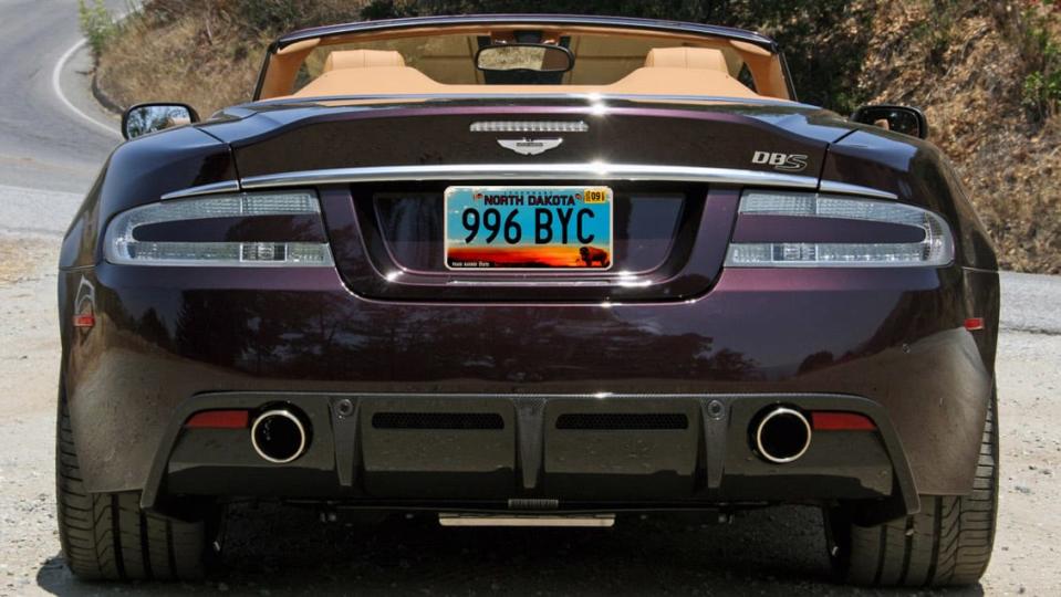
12. North Dakota
This is similar to Nevada's in general concept and I like it lot, however, the blue is darker (more likely to clash), the smear of orange depicting the Badlands is perhaps too bold and there's just a lot going on. Still, when evaluating it by itself away from a car, it's a tidy, striking design that seems appropriate for the place.
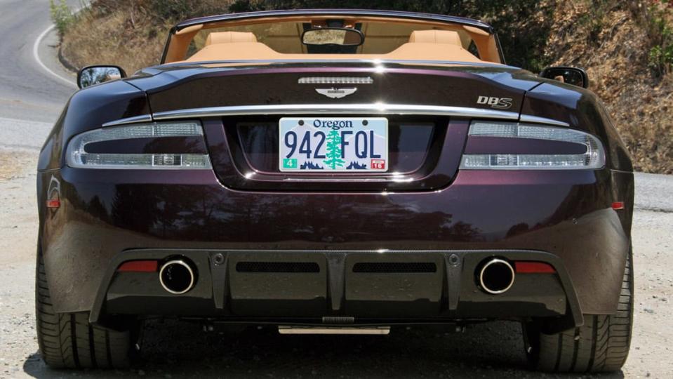
13. Oregon
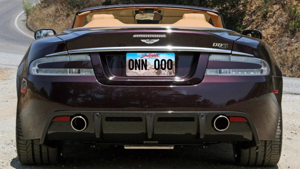
This instantly recognizable plate checks off most of the boxes. It's stamped with six digits. There are mountains and forests that look like that in Oregon, and there's literally a tree that looked just like that out my back window in Portland. The "Oregon" font is unique as is the general color scheme, but that's ultimately a problem. Lilac is not a color that pairs well with much (besides the purple Aston Martin I ironically chose for this little exercise) and that tree draws too much attention to itself. A nice plate by itself, but once on a car, there's a reason I paid extra for Oregon's Delaware-like Pacific Wonderland plates.
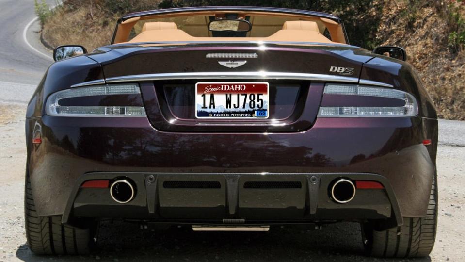
14. Idaho
Again, a terrific design indicative of the state. Idaho is scenic and it is famous for potatoes (mostly thanks to its license plates). There are mountains and forests there. The plate is aesthetically pleasing, even with as many as seven digits. The problem, besides being quite obviously printed rather than stamped, is that two bold, darker colors and white draw too much attention to that design once placed on the back of a car. It should complement, not distract. At least this is a much better example than others (cough, Pennsylvania, cough).
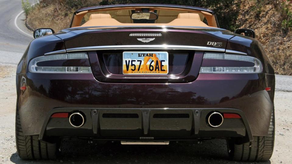
15. Utah
Arches National Park is in Utah, and there's definitely not other plate like this. Yes, the orange is an awful lot and the illustration veers a little into Toon Town territory, but at least it's not that busy. Six well-spaced registry digits, a four-letter state name and a good slogan of "Life Elevated" in a small font helps. This is actually one of two standard Utah plates, with the "Greatest Snow on Earth" plate being the other. I'm not sure where that would've ended up, but I like this one better.
Tier 4: A little too classic
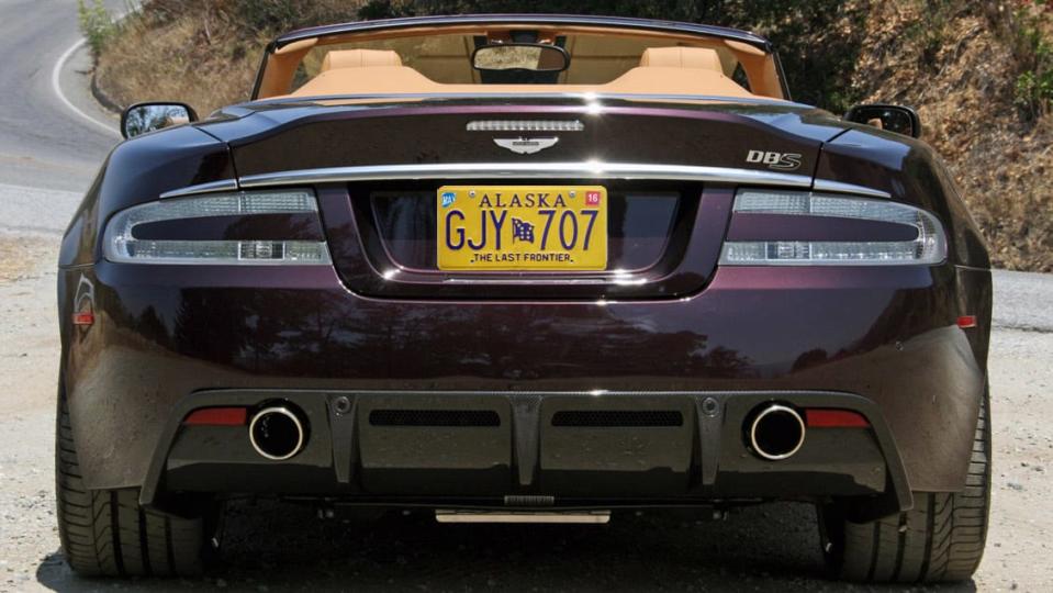
16. Alaska
When this list was first published, Alaska was No. 6 and was grouped in the top Colorful Classics category. After great reconsideration, however, the blue-ribbon commission consisting of myself decided that just being a simple, classic design shouldn't necessarily put a state up at the top. As such Alaska and the next two entries have been bumped down into this new category. So, why does Alaska get bumped? Well, as I originally pointed out, this shade of yellow doesn't pair well with everything – reds in particular – and is awfully indicative of a taxi. Despite all of the above, though, it's still a tidy design that updates a classic used from 1981 to 1997. Previous plates were broadly similar in concept with the exception of this one-off gem and the design from 1976 to 1981 that itself is enjoying a comeback as a no-cost option plate. So although Alaska isn't as high on the list as it was before, it's still deserving of a lofty spot.
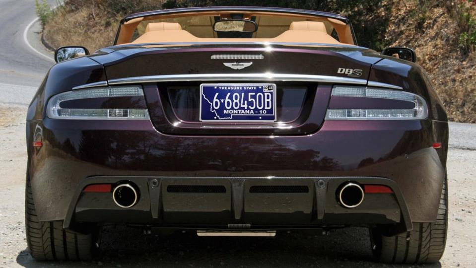
13. Montana
According to its DMV, Montana has five standard license plates you can pick up for the same fee. However, four of them are previous standard designs. The current, official standard one is this modern classic. It's a great color (as Michiganders could once attest), has clean fonts, and then the coolest bit, the state outline. Would it be better if the entire plate was that shape? You bet. Ultimately, I dropped this down from the other colorful classics because it tries to fit way too many digits into the map, which creates clutter and an awkward asymmetry. The whole plate also looks quite obviously printed.
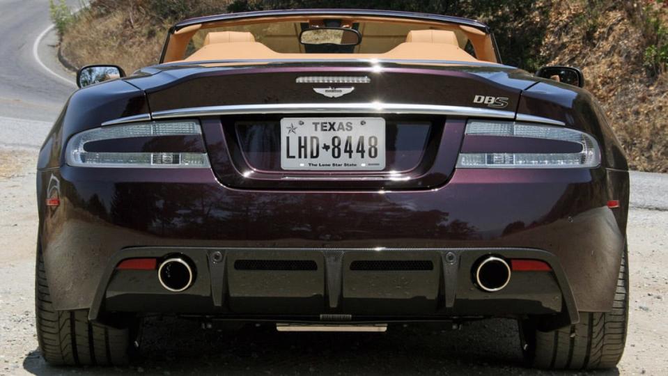
14. Texas
Of all the feedback I encountered after the original list order, Texas (No. 7) was the one that drew the most ire. Much as I originally thought, people think it's way too plain and that it looks like a paper temp plate. They're not wrong, which is why it finds itself bumped down into this new category. Nevertheless, this license plate still has most of the elements that make a great plate. History and consistency: Texas had black-and-white license plates for decades. Clean design with appropriate decorative elements: clearly read state name, a unique emblem (lone star), a map of the state as the registry number separator, and the state nickname. Uncluttered: Texas doesn't use registration stickers and managed to split the seven-digit registration number in two, which improves aesthetics and maintains legibility. Stamping this plate rather than printing it would make a huge difference, or even swapping the colors so that it's white on black as was done in the past. As it is, though, I'd still rather have this on my car than most others.
Tier 5: Acceptable
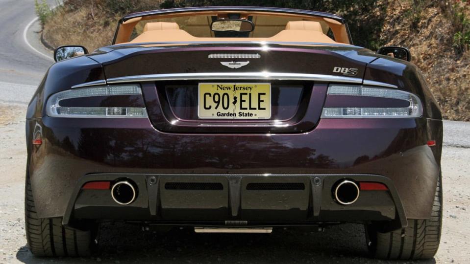
19. New Jersey
At first glance, this plate isn't much, but it checks a lot of boxes. The pale yellow color unique among plates, making it instantly recognizable. It also has the state nickname and always-appreciated state map breaking up the six-digit registry. Solid plate. If it was stamped on a solid background with this same color (no ombre), it would probably find itself in the top 10. Ditching the anti-counterfeit squiggle would be nice, too.

20. Mississippi
The use of the state seal as a graphical element is lame, especially as one as generic as Mississippi's. Honestly, this was going to end up in the "Fine" category, but then I saw it on the purple Aston Martin up there. Turns out, the bold choice of gold pairs quite well with rich colors (plus black). Electric ones or white? Probably less so. The Mississippi font has also been used for ages, so points for consistency.
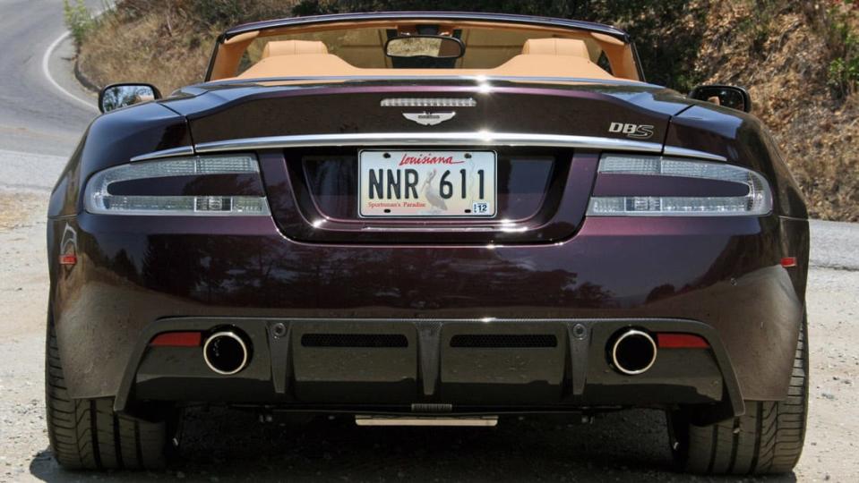
21. Louisiana
Thanks to the New Orleans basketball team and this license plate, I think we can all safely say we know there are pelicans in Louisiana. I can't say I really want one on the back of my car, though. Ultimately, this is a nice, uncluttered design, with a distinctive color scheme, a good slogan, and yep, a big old bird.
Tier 6: Distinctive and symbolic, but busy
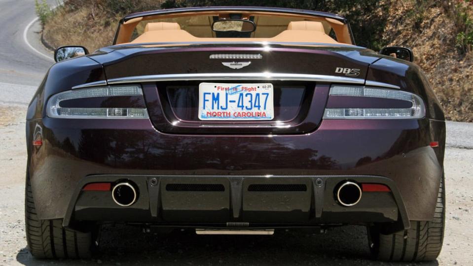
22. North Carolina
With a few tweaks, this plate would probably rocket up the list to somewhere around Maine. First, the fonts are too brightly colored, easily clashing with the car itself. Second, the "North Carolina" is punctured by the plate holes, which could be corrected by making the font smaller or moving it up (see New Mexico). And third, "First in Flight" is also too big and yet can still be difficult to read because of the Wright Brothers doing their thing in the background. Ultimately, this plate is just a bit busy and could use a subtle update of the same generally solid design.

23. Washington
This plate could have easily been up around No. 12, except it was utterly ruined by shoehorning the seventh digit into the open space that proudly showed off the diffused depiction of Mount Rainier behind. Other states, like New York and Texas, managed to fit seven while maintaining the space and general aesthetics (you can also do what Arizona and Florida do and switch to a non-sequential six-digit format). Such a shame. That unique Rainier backdrop, flush-left state name in bold red, and the clean contrasting "Evergreen State" was originally a great design. Washington just mucked it up. Worse, from afar, it kinda just looks like a dirty California plate.

24. Wyoming
Wyoming has had that iconic Bucking Horse and Rider emblem on its license plates since 1936, which speaks to knowing a good thing when you have one. Until 1975, it pretty much just changed colors every year, then added a fence to the bottom and a very McDonalds/San Diego Padres color scheme throughout the late '70s and '80s. Since then, the state has taken full advantage of license plate printing technology with various photorealistic landscapes in the background. The latest one adds a rope border around an image of "the Green River Lakes and Squaretop Mountain." There's just a lot going on and it’s a tad cartoony. I debated putting it in the Toon Town category below, but then I ultimately decided it's just a vastly better design than the others below and also is more of a photo-realistic landscape than a cartoon. I wouldn't hate this on my car.