
 Yahoo Autos
 New Honda EV Logo Is a Minimalist Throwback

Honda debuted its new "0 Series" line of future electric cars at the 2024 Consumer Electronics Show, and any time any company enters a radical new era such as this, tweaked branding usually isn't far behind. To be used on electrified Hondas from here on out, here's the new H logo, everybody.
Matching the light, simplified spirit of the 0 Series, the new e-Honda logo is frameless. What's more, the sides of the H are less upright, making it look a bit like two outstretched hands. Honda says this is to express its "commitment to expand the possibilities of mobility and continue to meet the needs of its customers."

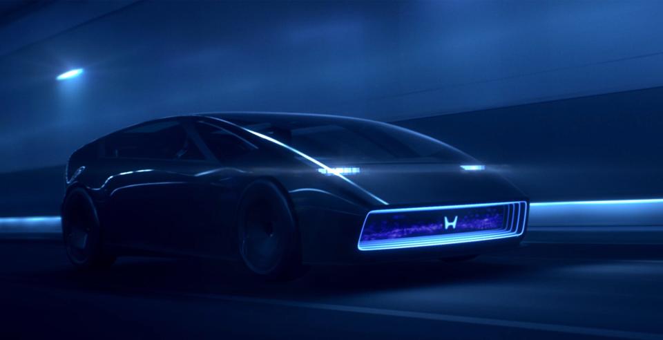
Mobility expanding or not, here's how it looks on the nose of the new Saloon EV concept.
This new H badge also happens to be a throwback design. Before 1981, the Honda badge went without the square frame that it has now, and the original logo from the '60s even does the slanted-sides, raised-hands thing that this new one does.

The company has also unveiled the logo for its 0 Series line of EVs. And as designs go, I think it's a very clever one. Check it out:

In case you hadn't noticed, the 0 is displayed in a way where it is also a deformed H. The whole vibe is also very Japanese-video-game, somehow. Very Final Fantasy. Very Resident Evil.
But what say you? Is the new electrified Honda logo a cool bit of retro rebranding? Or yet another unnecessary change for change's sake?
Got a tip or question for the author? You can reach him here: chris.tsui@thedrive.com
