
 Yahoo Autos
 Lamborghini Is the Latest to Fall Victim to the Flat Logo Trend
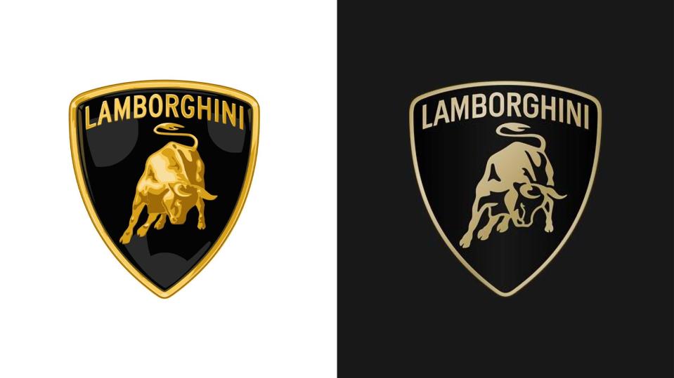
Would it surprise you to know that there are still some automotive brands out there that haven't drained the texture and depth out of their famous logos yet? Lamborghini was actually one of those storied marques that hadn't responded to the so-called digital revolution up until now and, I think at this point, you would've just chalked it up to Sant'Agata not really caring about stuff like that, because they're freaking Lamborghini. But it's Thursday, March 28, 2024, and the originator of Italian wedges on wheels has a "new" logo that's a lot like their old one, only flat and with a typeface best described as looking like it was lifted from Google's free collection.
This is Lambo's latest logo, and I'll tell you where my mind went straight away: the Brooklyn Nets! It looks like the shield for the basketball team Jay-Z used to have a stake in, especially in that black-and-white getup. The brand says that additionally, for the first time in its history, its raging bull will be separated from those borders in some uses, particularly on "digital touchpoints." No example of that's been provided yet, but you can imagine what that'll look like.


Lamborghini's announcement of the change also mentions a new custom typeface "that echoes the unmistakable lines and angularity of the cars." I don't know what that means, especially because the mockups the company's shared with us have a variety of typefaces, and there's no obvious way to know which, precisely, the press release is referring to. The one on the logo does look a lot like Google's Roboto to me at first glance—which happens to be used on Lambo's media portal—but it isn't. In any case, it feels like a step back in terms of individuality, but that's why these adjustments happen, after all. Even Lamborghini is concerned about falling behind the times.
Can you tell I'm just not feeling it? The whole "flat design" thing has been kicking around since like 2013, and some automakers, ever on the cutting edge of visual art, are only catching up to it now. The monochromatic look is often justified for its readability particularly on screens, but was anyone really having a hard time identifying Lambo's shield and bull before? The way pretty much every brand has gone about this is to take their existing insignias and uncheck the blending options box on Photoshop, and listen, it just never results in anything interesting.
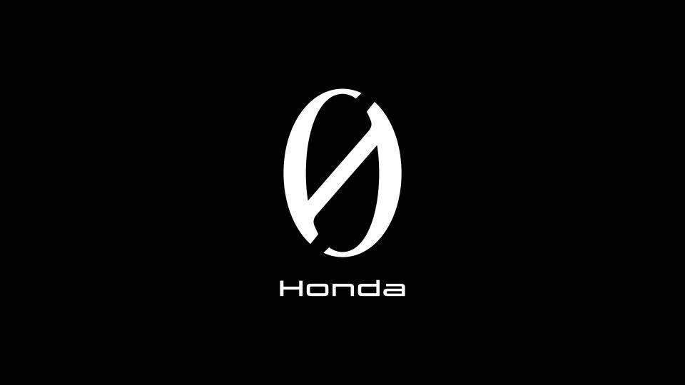
If you've gotta go flat, you should move to something that looks interesting and complete, flat. That's what Honda's done with the new treatment for its 0 Series EVs seen below, and I think it's genius. The slashed zero looks like something I'd see in some kind of subtly unsettling futuristic Japanese story-driven action game, and the fact it also works as a skewed "H" is just so dang clever. Paul Rand's Ford logo is another example of flatness with purpose, as it still looks progressive almost 60 years on.
What Lamborghini's done here is far from the worst automotive logo redesign I've seen yet; that distinction would have to go to Peugeot or Citroën, which not only went for something unremarkable but obviously tried way too hard to come across as futuristic and aggressive. The only thing worse than being boring is lame. Lamborghini was never going to reach as far, because it doesn't have to. But like Ferrari, it should know by now that the hardest power move you can make as an iconic brand is to never change, especially when everyone else does.
Got a tip? Send us a note: tips@thedrive.com
