
 Yahoo Autos
 Lamborghini’s New Logo Looks a Heck of a Lot Like the Old One
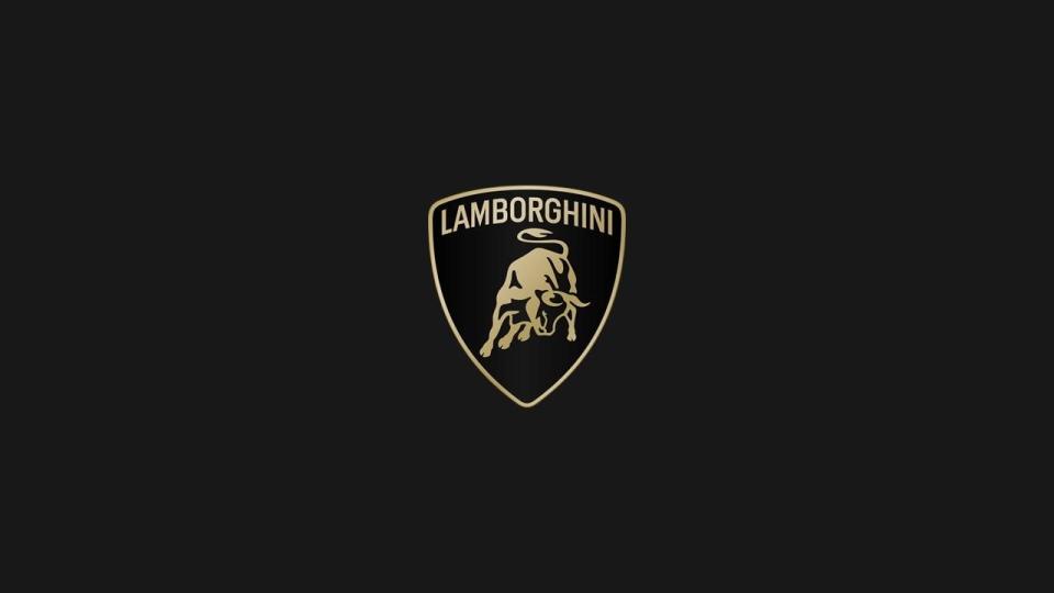
Lamborghini has revealed a redesigned version of the iconic raging bull logo for the first time in over 20 years.
The new logo has an updated font and the bull loses much of its previous 3D look.
According to Lamborghini, the new logo is a better representation of the "brave, unexpected, and authentic" values of the brand's mission.
Here, take a closer look at this. No, no, even closer. That's better, but you're probably still going to need to squint; Lamborghini just revealed a redesigned version of the iconic raging bull logo for the first time in over 20 years.
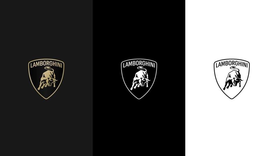
The changes to the logo are minimal, and assuming you aren't a Lamborghini historian or a logo fetishist, you could just as easily miss them. The new crest has been toned down slightly, losing its previous 3D look. At the top of the logo, the "Lamborghini" typeface features a "broader" look the company says is actually part of a new official Lamborghini typeface designed to evoke the angularity of its cars.
Lamborghini says the new logo is more than just a refreshed badge, and is actually part of a larger transformation of the brand. According to Lambo, the new logo better represents the "brave, unexpected, and authentic" values of the brand's mission, which includes "Driving Humans Beyond."
We have renewed our historic logo to adapt the brand's visual expression with the "brave," "unexpected," and "authentic" values of our "Driving Humans Beyond" mission and is part of the ongoing process of evolution, initiated with our Direzione Cor Tauri strategy.#Lamborghini
— Lamborghini (@Lamborghini) March 28, 2024
Black and white take over as the logo's primary colors, while yellow and a new gold hue become the new accent colors. Immediately following its unveiling today, the brand began using the new logo throughout its social media channel—sans shield. That's because Lamborghini wants to "lend it even greater prominence" by allowing the iconic bull to exist apart from the crest. Don't worry, though, the shield will still proudly adorn Lamborghini's vehicles. The company promises the shieldless bull is only for its digital footprint.
You Might Also Like
