
 Yahoo Autos
 No, Your Eyes Aren’t Deceiving You, There Actually Are Two Different Road Sign Fonts
Hello and congratulations on clicking on a story about road sign fonts, you’re officially a nerd — the best kind, obviously. The only approved typeface used on U.S. road signs between 1956 and 2004 were variations of a font colloquially called Highway Gothic, and formally called Federal Highway Administration (FHWA) Standard Alphabets for Traffic-Control Devices. In 2004, the FHWA granted interim approval for a new road sign typeface called Clearview, which was optional for states to adopt as they replaced road signs. From 2016 to 2018, the FHWA rescinded Clearview’s approval, but re-approved it after 2018 so it’s still available for states to use on their road signs.
Why did some people want to move away from Highway Gothic as the de facto typeface on road signs? As a larger portion of American motorists grew older, complaints began rolling in surrounding the chunkiness of Highway Gothic letters. Aging eyes sometimes had a difficult time deciphering the lack of negative space in Highway Gothic lettering, causing letters to appear as amorphous blobs. The New York Times Magazine reported in 2007,
Issues of readability were becoming increasingly important, especially at night, when the shine of bright headlights on highly reflective material can turn text into a glowing, blurry mess. Highway engineers call this phenomenon halation and elderly drivers, now estimated to represent nearly a fifth of all Americans on the road, are most susceptible to the effect.
“When the white gets hit, it explodes, it blooms,” Meeker [Don Meeker, an environmental graphic designer and a designer of Clearview] who has the air of a scruffy academic, went on to say.
He placed two road signs side by side on his couch and shined a flashlight at each in quick succession. In the path of the moving beam, the first, a white-on-black street sign from the early 1900s, remained dark; its letters became momentarily lighter but not much brighter. As he moved the light to the second sign, a more modern white-on-blue sign taken from a nearby intersection, its whole surface brightened, sending back waves of light and giving the letters a fuzzy, white glow. Repeated at 70 miles per hour, especially for drivers with impaired vision, the effect is not only annoying but also dangerous.
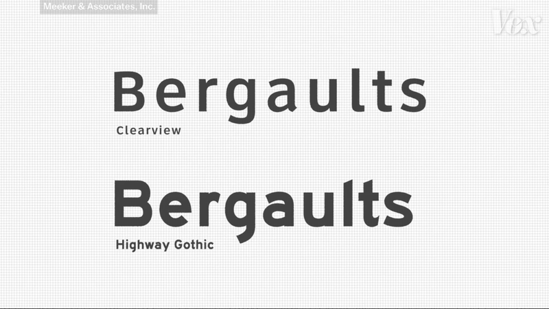
Clearview is a typeface that introduces more negative space within the letters on a sign, which is intended to minimize the phenomenon of halation. Along with Clearview’s decreased blobbiness, it also introduced a higher x-height, or the difference between the height of the lowercase letter x compared to the height of capital letters.
Increasing the x-height of Clearview resulted in a significant improvement in readability at a distance, so much so that it freaked out representatives of the FHWA during a side-by-side comparison between signs written in Highway Gothic and signs written in Clearview. Clearview’s interim approval was briefly rescinded in 2016. Car and Driver reported,
In 2016, the approval was rescinded on the basis that earlier studies as to Clearview’s clarity weren’t so clear. Then, because this is a massive bureaucracy we’re dealing with, last year [2018] the FHWA reinstated the interim approval granted 14 years earlier.
Regardless of the highway sign typeface that is easiest for you to read, keep an eye out for font differentiations, especially on road trips. Since Clearview was approved on an at-will use basis, some states chose to use it and others stuck with good ol’ Highway Gothic. Other states use a mix, with many states only using Clearview in a single region or city in the state. The differences between the two fonts are illustrated in the TikTok video above. It’s most apparent when looking at letters like a lowercase l, t or d, which have angled tops in Highway Gothic and flat tops in Clearview, or letters like lowercase a, e, g and s, which illustrate the increased negative space within letters in Clearview font and the chunkiness of letters in Highway Gothic.
You are now free to annoy your friends and family on road trips with this new tidbit of generally useless information about standardized road sign fonts in the United States. If they ask why you know this, tell them some nerd named Logan taught you.
