
 Yahoo Autos
 Why Your Sneakers and Beauty Products Are Pretending They Came Out of an Auto Factory
Artists and designers have always found inspiration in unexpected places: Charles and Ray Eames’s iconic molded plywood chairs were influenced by the design of World War II leg splints. Frank Lloyd Wright looked to nature, presumably nautilus shells, for the design of the Guggenheim. And Andy Warhol was a fanatic for the humble Campbell’s Soup can. But the newest place that creatives are looking for inspiration might be the most unexpected yet: their car windows. I’m talking, of course, about auto-glass codes.
You know the ones I mean. You find them in the bottom corner of your side or front window, usually flanked by a constellation of small black halftone dots (called the “frit”). They’re typically bunched together in an orderly cluster: a combination of circles, numbers, and letters, plus the occasional phrase set in a utilitarian sans serif or monospaced font—the same kind of single-width digital letters you might see on a receipt or in a Nineties movie about hackers. In the auto-glass industry, this conglomerate of symbols and information is called a “bug.”
These bugs aren’t meant to be noticed, and they definitely aren’t deliberately design-forward (though automakers do occasionally embed playful ‘Easter eggs’ into window glass). That said, they do communicate significant information. Almost half of the symbols on auto glass signify certain safety certifications, each required by a different regulatory body or region (think of the E.U. organic leaf and the USDA seal). One of the largest symbols, and one of the most frequently mimicked, is the circled letter “E,” which signifies compliance with European Union regulations, where the number represents the country that granted the approval (Germany gets 1; France, 2; Italy, 3; and so on). The oval CCC, on the other hand, stands for “China Compulsory Certificate” and is mandatory on both Chinese-manufactured and foreign-imported goods from auto glass to tires to fire-fighting equipment. Other marks note whether a glass is tempered or laminated, when it was made, who manufactured it, and, sometimes, what car brand it’s been made for.
While laminated glass has been used in windshields since the early 20th century, it wasn’t until the formation of the National Highway Traffic Safety Administration in 1970, under the auspices of the Department of Transportation, that the United States saw a concerted effort to standardize and enhance automotive safety standards. The Federal Motor Vehicle Safety Standard 205, which specifies the requirements for automotive glazing materials, is one such regulation aimed at ensuring that auto glass is safe and does not contribute to injuries in the event of a crash.
The overall look of all these combined symbols and text is graphic, streamlined, and a bit opaque; clearly designed by experts for experts. But there’s also something unexpectedly playful about it. While each individual component included in the arrangement is practical, orderly, and free of decorative excess, the symbols themselves don’t actually match; each follows its own set of visual rules. The UNECE (United Nations Economic Commission for Europe) regulation mark includes a thin circular outline, while the CCC text is surrounded by a bold oval. All the typography is sans serif, but it’s not all the same sans serif. It’s a quirky patchwork of almost matching forms, a juxtaposition of functional simplicity with eclectic ornamentation. Karina Yazylyan, a designer in Moscow whose thesis project “The Aesthetics of Technical Information” focuses on the aesthetic value of enigmatic labeling like that found on auto glass, also notes that since most consumers are unable to “read” the content of these various symbols and phrases, the text is instead perceived simply as a graphic composition, a set of vibey shapes.
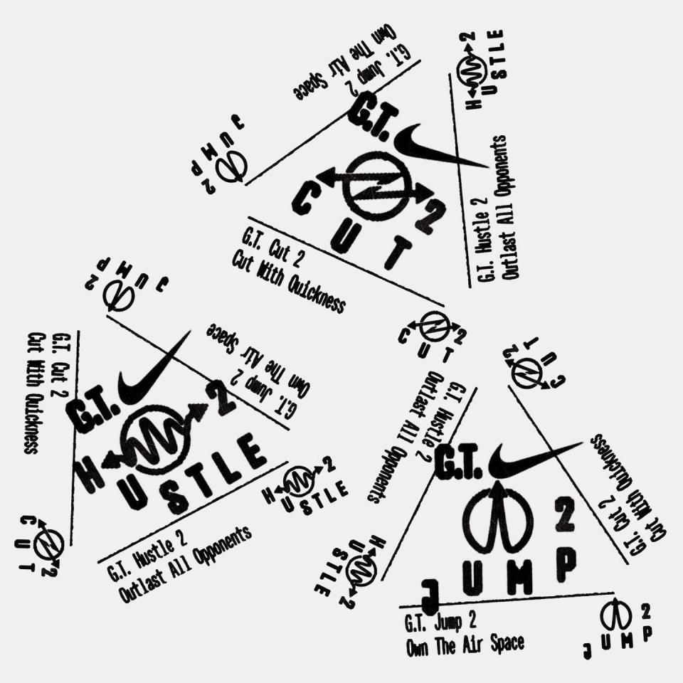
Designers’ contemporary reinterpretations of this automotive normcore, as it’s come to be known, vary widely—some faithfully replicate the exact forms and layout of the car window, while others use these icons as a springboard to make their own structured lockups of geometric symbols, phrases, and shapes. The trend has shown up in more industries than not in the last few years: luxury speakers, Gen-Z-friendly makeup, South Korean streetwear, and just about anything from Nike. It’s visually related to a larger shift in the design world toward utilitarian visual cues, like the use of visible legalese, UV printer typography, or stylized barcodes, albeit more obscure in provenance.
Mike Smith, founder of Philadelphia-based design studio Smith & Diction, used automotive normcore motifs in a recent branding project for AI-search startup Perplexity. He felt the style was an effective choice for the app—which is targeted at more high-tech, code-savvy users than other AI tools like ChatGPT—as it conveyed “that the content was highly technical, not necessarily for the average consumer, simply through its visual vernacular.”
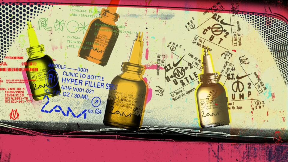
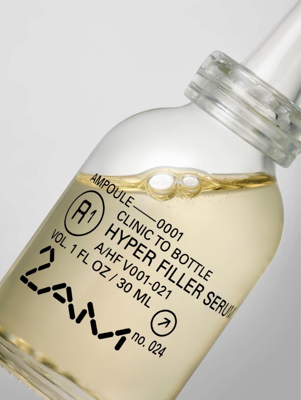
Toronto-based creative studio Concrete took even more direct inspiration from car window bugs in its visual identity for 2AM Skincare. The name of the brand, 2AM, refers to the time of night when skin best rejuvenates itself, which prompted director of design Jonathon Yule and his team to reimagine LCD numerals for the brand’s distinct logo. As 2AM’s products are packaged in glass bottles, the designers decided to look into the world of glass manufacturing as well, which eventually led to them using the small yet dense layouts of car-window text for inspiration. Yule says that “in skincare and beauty, so much of the work we do is to create an organization system that is clear, distinct, easy to expand, and beautiful all at the same time. The system we came up with for 2AM does all of these.”
But why has something that’s been in our driveways for decades just come to the forefront now? Yule believes the trend is a practical one.
“It makes something feel technical and tested, which in turn gives the viewer a feeling of confidence in a product or brand.”
That certainly aligns with the evidence, given that this car-window style is especially popular among brands selling products focused around performance, like AG1, a health supplement, or the North Face’s technical wear. In a world saturated with dopamine dressing and graphic-design maximalism, automotive normcore might also be a return to a certain type of simplicity, but one with more nuance and logic than the cold blanding of the last decade. It certainly also has roots in a larger societal resurgence of Nineties aesthetics, which were dominated by pixelated type, digital artifacts, and DIY grunge that embraced pulling imagery from unexpected sources in a manner akin to these mixed utilitarian symbols.
Smith thinks the burgeoning interest in this aesthetic has more emotional roots. He notes that most millennials grew up without the distractions of social media and smartphones and, therefore, were more aware of their immediate, mundane environments.
“We looked at things that were directly in front of us for hours while on the bus to school or on a road trip with family. We had no choice but to ingest this kind of information whether we liked it or not.”
He suspects that this generation, now in their late twenties to early forties, has matured into the ranks of leadership, steering the direction of senior creative teams with a decade or two of career experience behind them—and they’re using that seniority to embed their work with these same symbols that once captured their undivided attention. The effect is a meaningful, nostalgic counterpoint to today’s sleek, minimalist gadgets, many of which seek instead to conceal such visual jargon. As for me, I just know where I’ll be looking the next time my phone dies on an Uber ride—I’ve learned you can always find inspiration in unexpected corners.
You Might Also Like
